Website

Year Five is Live!

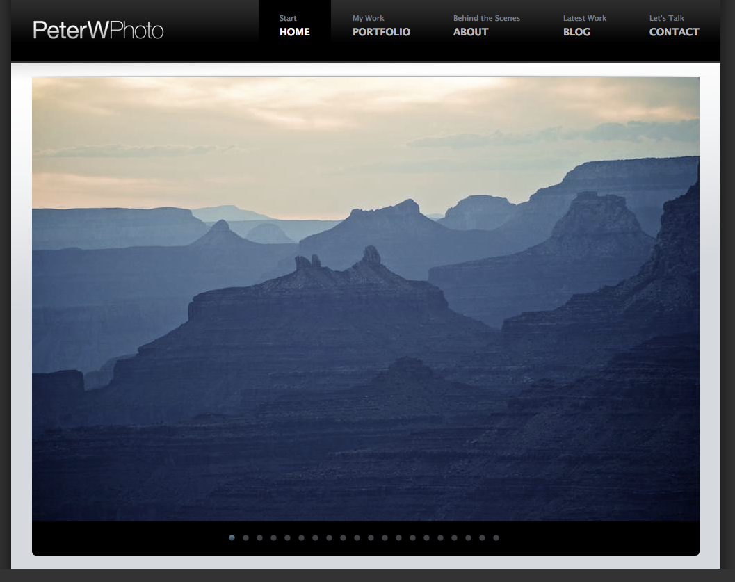
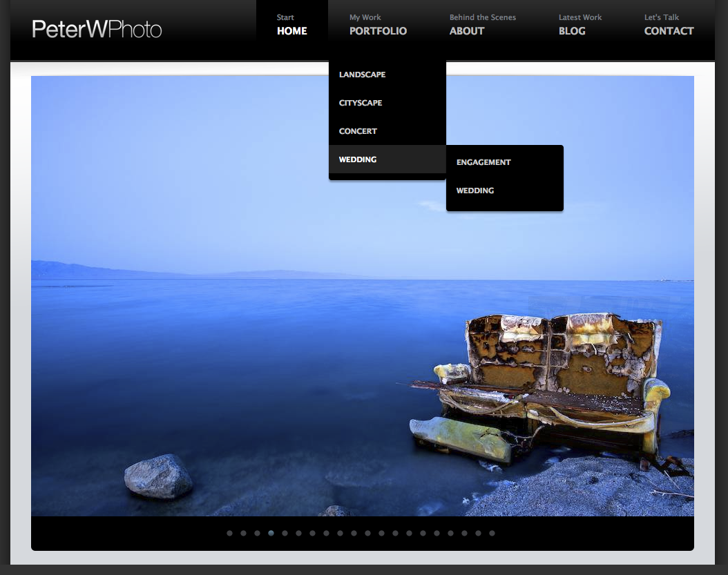
Creating this site has taken far longer than I would have ever expected. Sure it is a completely rebuilt site but.... it looks about the same? (www.peterwphoto.com) homeWell it is not at all. This version is several steps ahead of the other site. This site is 100% based around my blog and the iPhone. Images are larger and wider than they have been previously. This is the very first flash free version of my website. This means that every single iPhone will be able to load all of my pages and interact with the site. Zooming in on the thumbnails and selecting the images work flawlessly.

galleryI as a photographer see a lot of images that I like but may not want to capture 15mb worth of the image. Very often I will take a picture with the iPhone and do some on the spot editing, smile and then put the iPhone back in my pocket. I have gathered a collection of images that were taken by the iPhone and created its very own gallery page. I want to show off how capable this device is.

iphoneNow onto the other big player in the new version of the site, my blog. If you are a photographer and you do not have a blog you might as well give up. Blogs allow people to get to know you and also allow people to find you. Traffic to www.peterwphoto.com has doubled since I started actively updating my blog. I always tell people that I am one of the busiest photographers out there and the blog helps me to prove it! :) I have added a small blog snippet to the front page of the site to allow users to click one of the latest blog links that appear. I have also dedicated a page all to displaying the latest image large on my site. This page will constantly update so when users return they will see a new image even if they never visit my blog.

blogsnip

^Snippet

blogpage

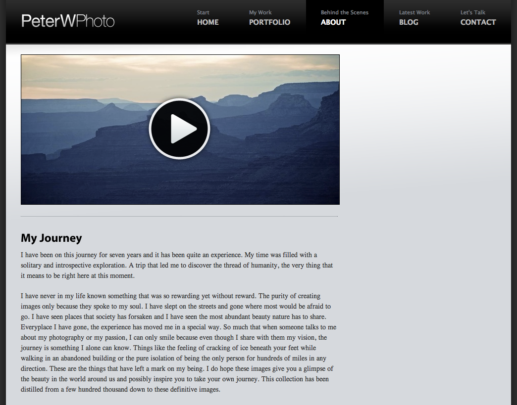
The Final large change has been a little video that I have been working on for a while now. To me the contact page has always been the most boring page of every website. A few people have done it right but most are downright bleh. The video is nothing fancy, its just a small amount of commentary alongside video and photos. The video of course will play natively on the iPhone!

contact

Technically the site is very simple. I have a vision that everyone should be able to access the site without extra thought of where do I go? I have visited some photo sites where I as a very techie person had trouble viewing. I never want my visitors to be distracted by navigation just the images themselves. I feel that if you disagree with me you should send your site to your parents and see how easy they get about viewing your work. I want my visitors to stay as long as they possibly can and take in all of the visuals.

_______________________

www.peterwphoto.com

_______________________

In the end it is all about getting the site on as many computer screens possible. It's all about placing my work in a clean way on the web where I am confident to point people to. I can finally pass out all of these new business cards and postcards.

East Coast Image Release Dates

I have been one of the busiest people I know the last few months. Planning for my future and being the most active photographer I know. I have given a lot of thought to the thousands of images captured while on my East Coast trip in early November. I revise my website (peterwphoto.com) every year and this year will be very special. This year will be my fifth year as a photographer. Five years is quite an accomplishment in my eyes and a big tip of the hat to the immense amount of time given to what until this year was a hobby. I will be slowly releasing all of my favorite East Coast images in celebration and in honor of the launch of the fifth version of my website.  I will release the images in the two weeks leading up to that moment I bought my first camera, February 14th 2006.

______________________________

Please join me here, February 1st 2010 to celebrate my biggest release as a photographer thus far.

PeterWPhoto.com update now Live!

I spent quite a bit of time being stubborn about the computer displays that I was going to support. I was building my website on my beautiful 24" iMac and always ignored how bad it looked on 13" computers.

screenres

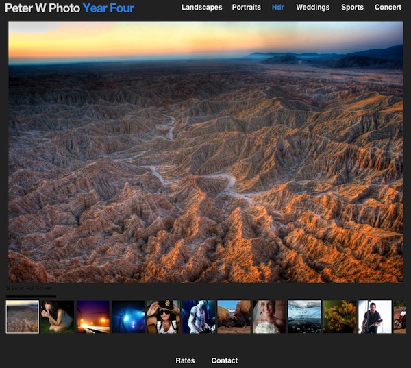
1280x800 has always been the most popular screen resolution, therefore I decided it was time to support it. My goal was to redesign the site so that a 13" computer can see a full size image along with the thumbnails.

smalltop

I started with a smaller header / top of the page because the old one was too big and didn't look so professional. I also added Hdr to the mix along with an actual Concert gallery. Hdr is highlighted in blue to represent that it is a new feature of the site.

newsite

I am very happy on how the site turned out. I added several of the new images to the mix and removed a lot of older images that no longer seemed to be at par with my current portfolio. I also added one new feature because I like my pictures big just like I like my music loud.

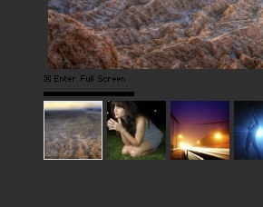
enterfullscreen

There is now a Full Screen button at the bottom of every gallery so those of use with larger screen can enjoy the images the size I want you to view them.

I have spent the good part of a weeks free time on the site and it is finally complete. If you do not know I redesign my website every year and relaunch it on my photo anniversary which is on Feb 14. Next February with be my fifth year of shooting and I am looking forward to the future. I really hope you all enjoy it :) Please give me feedback on the site and let me know if you run into any problems!

-Peter